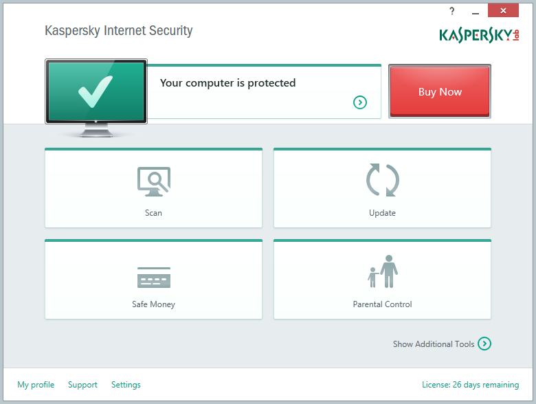
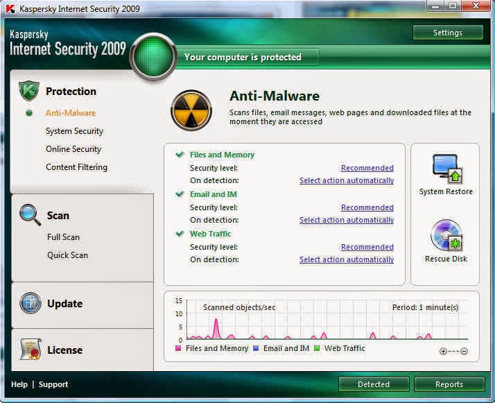
Anti-malware software shouldn't just protect computer systems from hacking/malware/phishing; the suites should also make the owner/user feel confident. The latter requires that psychology be addressed. Previous versions of KIS have boasted confidence-boosting user interfaces which clearly and boldly tell you - the user - that you are protected. Not anymore. KIS 2015, apparently in the interest of minimalism/simplicity, eschews the bold interfaces found in previous versions in favor of a rather bland and uninspiring design. Not good, even if the underlying protection technologies are the best ever!
KIS 2015:
Older versions:
Update [Jan'15]: Screenshot below is from F-Secure Internet Security 2014. It shows that the suite contains several distinct protection modules, all of which work in parallel to protect the system/user. Such a list of modules provides confidence to the user that, despite the minimal interface of this product, there are multiple technologies at work in the background.


No comments:
Post a Comment